People
Feedback
Project
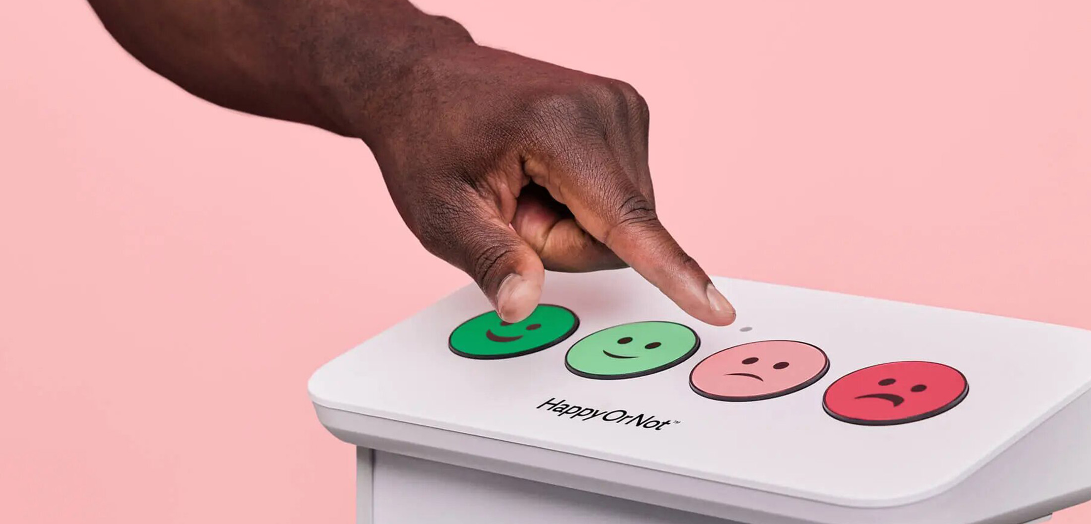
People Feedback is the main distributor in the Spanish market of HappyOrNot satisfaction devices, the world’s leading hot satisfaction survey solution.
They capture the emotions of the moment thanks to their devices through which feedback can be obtained, analysed and the customer experience improved.
Client
People feedback
Rol
Branding
Web Design
Strategy
Digital Marketing
Data
2021-2022

Identity
People Feedback builds strong relationships between people and brands through feedback. We look for a contextual symbol that represents the meaning of the brand and, in this case, brings together the two main concepts: people and feedback. By making creative use of symbolism we achieved an organic, communicative and minimalist symbol.
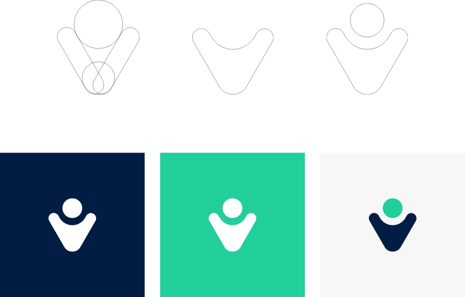
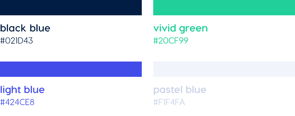
We built a digital and technological chromatic range based on the characteristics of the devices themselves, highlighting the colour green, which perfectly reflects the vision of the brand and the objective of obtaining positive feedback.
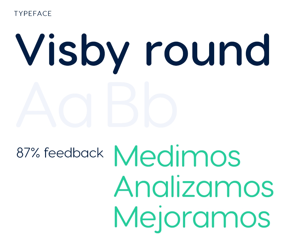
We chose a geometric typeface family with basic and versatile shapes, which allows us to play with different contrasts and enhances the brand’s identity and communication.


HappyOrNot
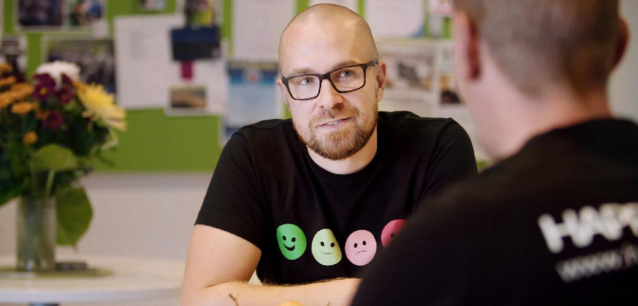
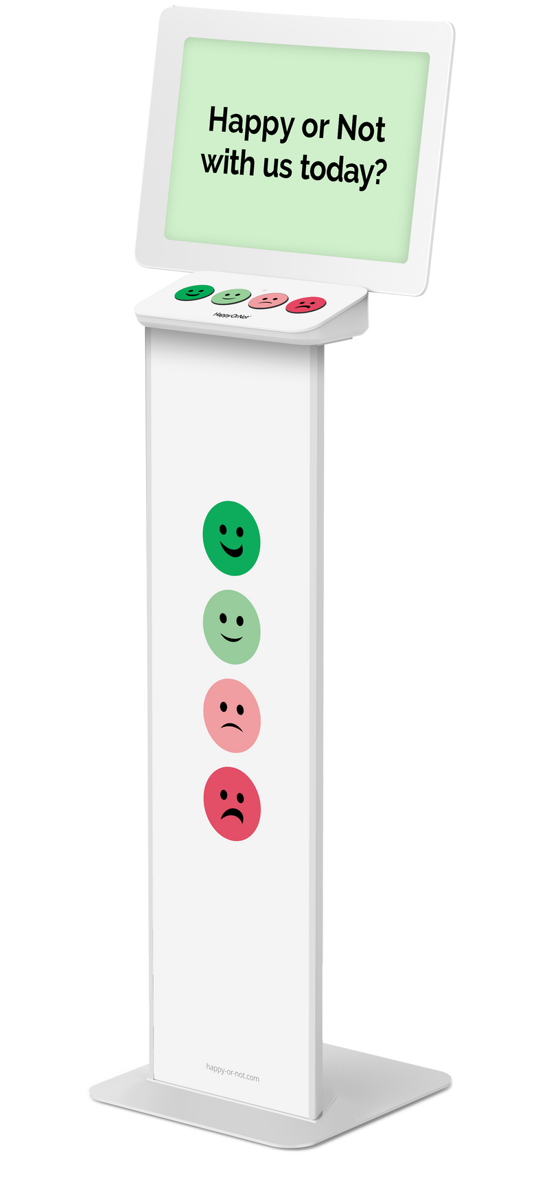
HappyOrNot is the heart of the new People Feedback brand identity, verbal and visual.
We sought to create our own brand language that, despite being binding, works on its own and can coexist in different communication media.

Visual system
A graphic universe has been created parallel to HappyOrNot that includes, among other creative elements, a customised iconography for the brand, with a dynamic line that connects the entire visual system.

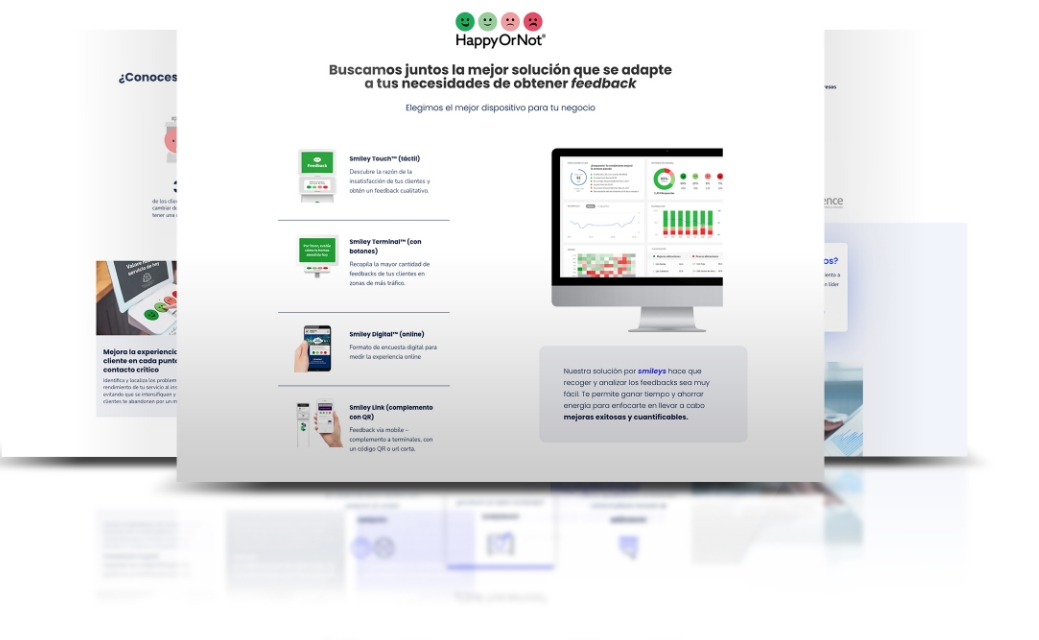
HappyOrNot is synonymous with quality assurance, which is why the link with the Finnish company has been the cornerstone of the brand’s strategy. As a result of a digital analysis, the People Feedback website was created to give the brand its own voice. This includes a structure and information architecture previously studied with the aim of working on organic positioning (SEO), designed under UX/UI criteria and putting the user at the centre of the experience.
Several specific landing pages have been created for each potential market, designed exclusively for the lead acquisition campaigns that have been carried out via Google Ads.
